
Sobrynth
The first step, made easier.

Sobrynth supports people with substance use concerns, and the employers who want to help them. We built a brand and a digital experience that make a sensitive subject easier to understand and the way in easy to find.
- Client
- Sobrynth
- Category
- Substance use support
- Our role
- Creative direction, brand strategy, messaging, experience design
- Audiences
- Employers and the people they serve
The brief
Explain a sensitive subject clearly, to employers and to the people they serve, without stigma.
The idea
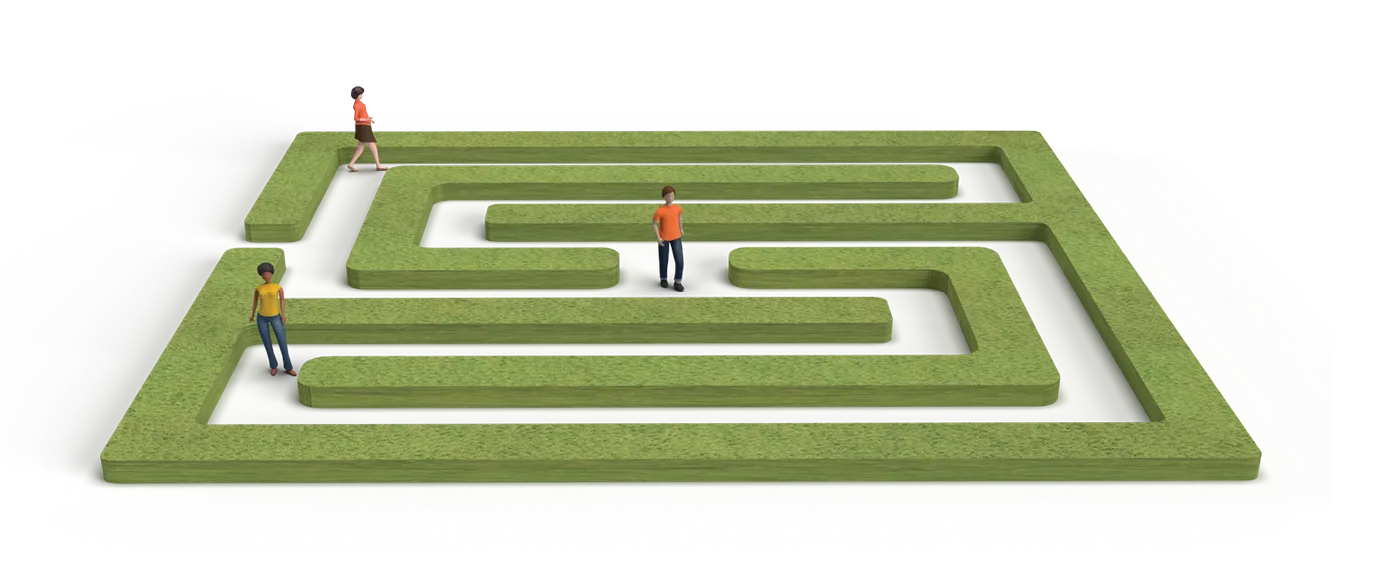
Recovery has turns. A labyrinth says so, and says you don’t walk it alone.
The result
One expression across the identity, the messaging and the app, built to help people see how to begin.
Navigating the way, together.
Six places the brand meets people, from the first look to the first day.
01 The mark
A path with turns, and a way through.
The S is drawn as a labyrinth and the wordmark is set in a handwritten script, so the brand feels personal before it explains anything.
Identity
02 The app
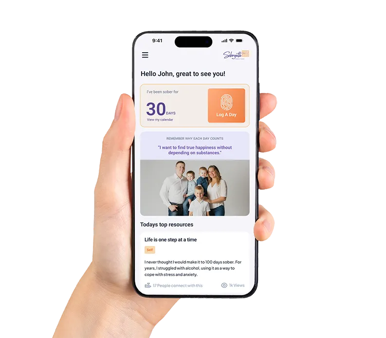
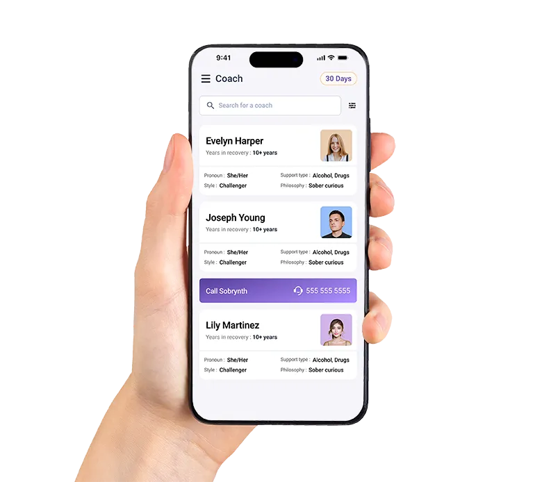
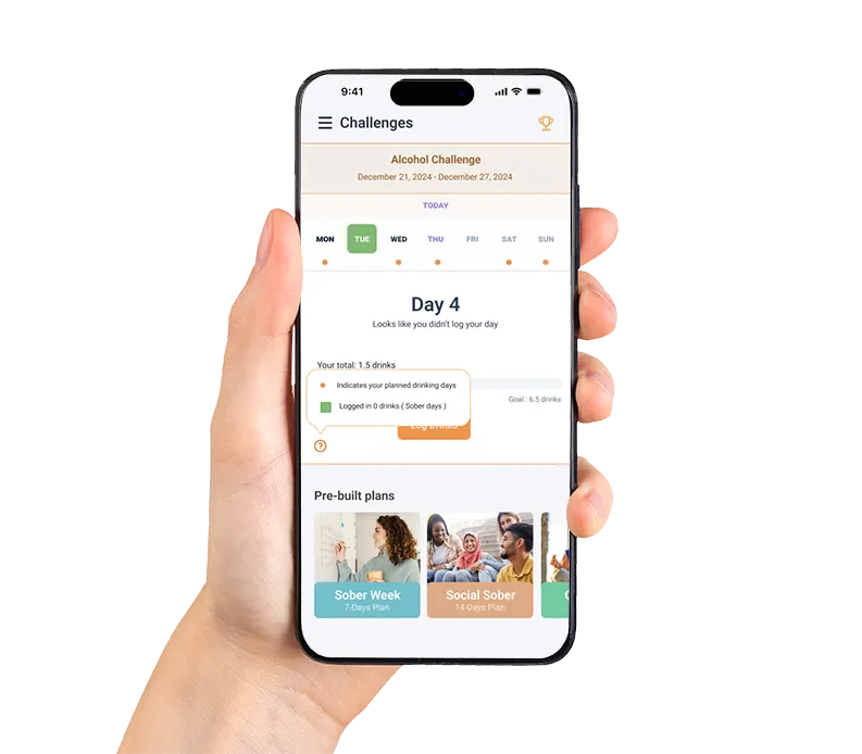
Home, a coach and a challenge.
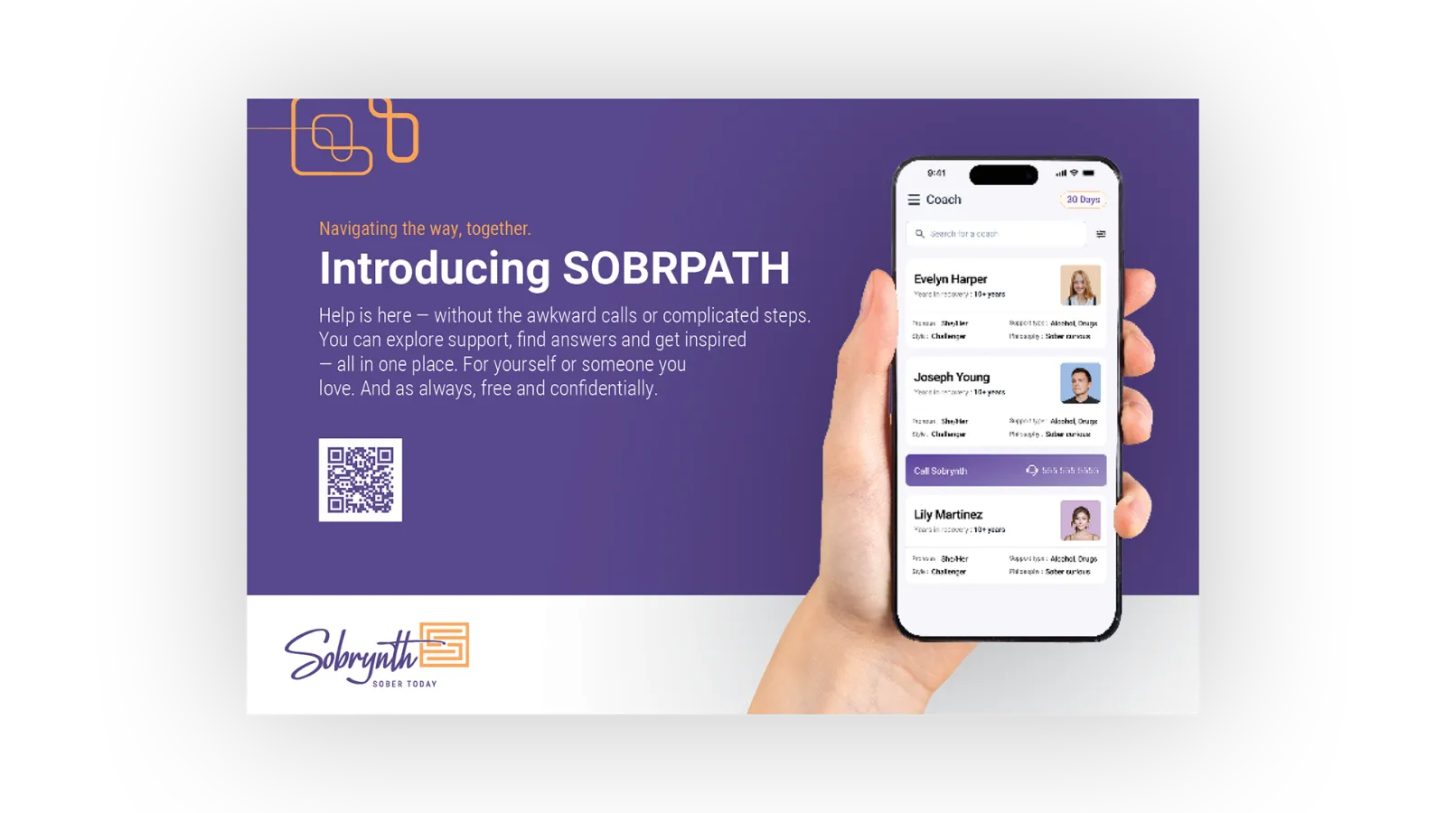
The app opens on a home view, makes it simple to find a coach and offers challenges to work through, each one a practical next step.
App experience
03 The web
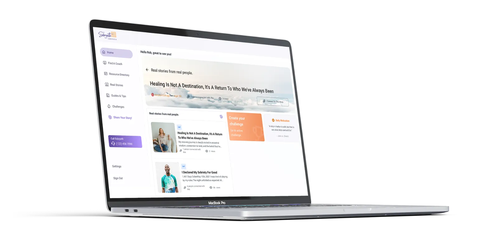
The same welcome on the web.
The web experience carries the brand’s language and look to everyone else, including people who are only curious.
Web and video
04 Outreach
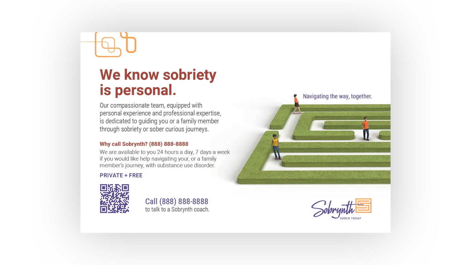
Sobriety is personal.
Flyers and cards introduce the service with a QR code, a phone number and a promise that it is private and free.
Outreach
05 Posters
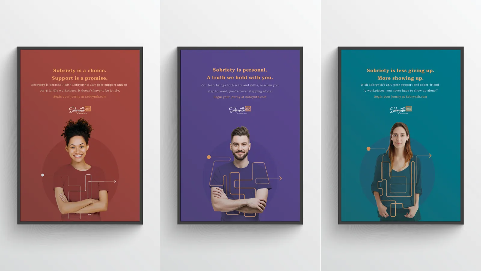
Real faces, plain words.
A poster series pairs people with simple statements about what sobriety can mean, set inside the maze.
Posters
06 Wearables
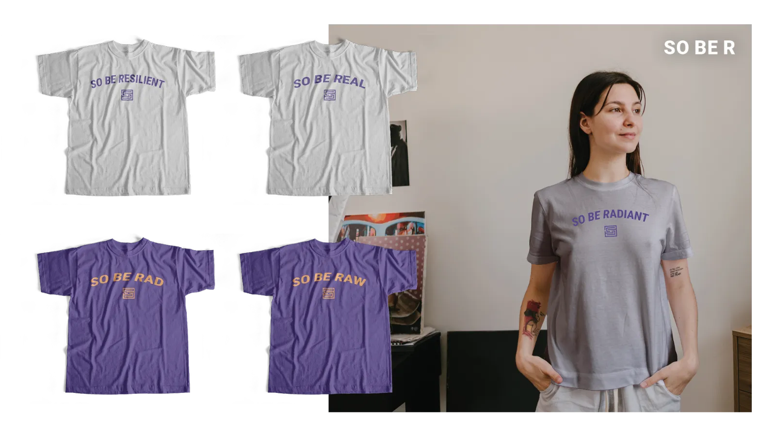
So be radiant.
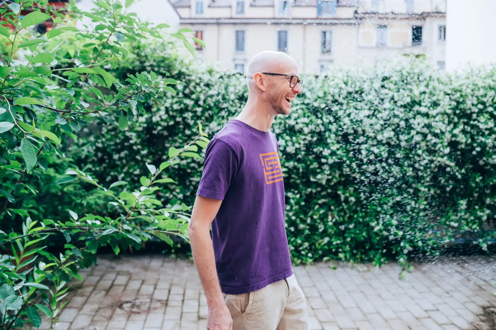
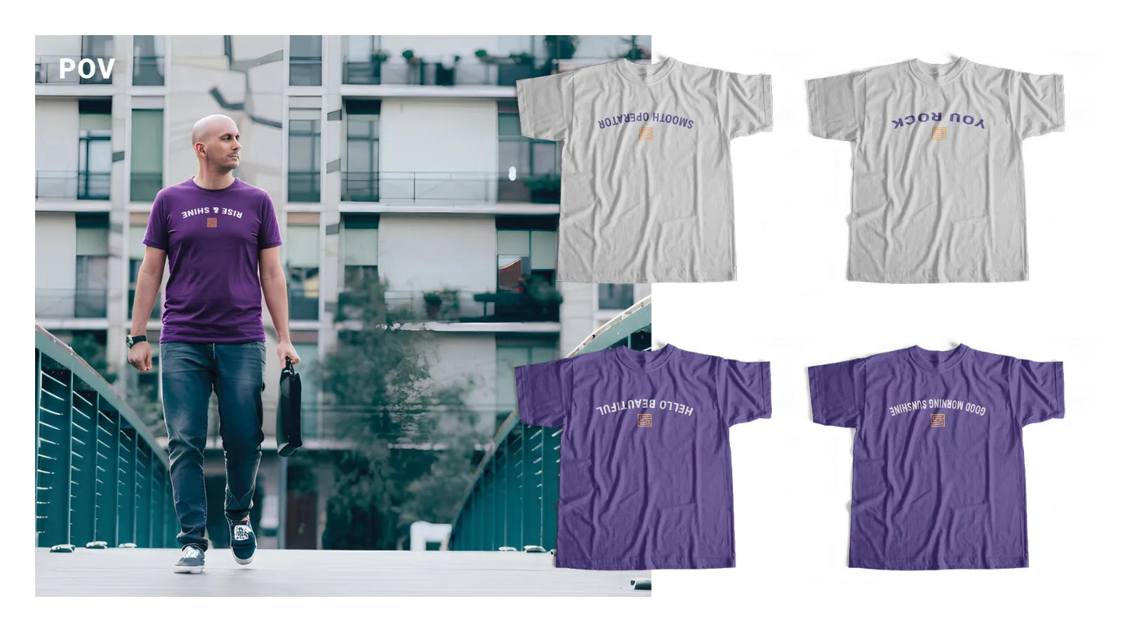
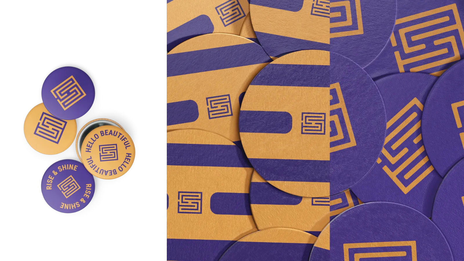
Tees play on the name with lines like So Be Radiant and So Be Real, and stickers and coasters carry the maze.
Apparel and merch
Built to help people see how to begin.
The brand and the interface were designed together, so the words people read and the buttons they tap say the same thing.
What we did
- Creative direction
- Brand strategy
- Messaging
- Identity
- Experience design
- App
- Web
- Outreach
- Merch