
Coca-Cola
Six promises, one bottle cap.
Coca-Cola Consolidated wanted its warehouse crews, drivers and frontline teams to see themselves in the brand they work for. We gave Be, its employee program, a look that dresses six promises in the same red everyone already knows.
- Client
- Coca-Cola Consolidated
- Category
- Bottling and distribution
- Our role
- Creative direction, campaign development, brand expression
- Audience
- Warehouse crews, drivers and frontline teams
The brief
Make a bottler’s promises to its people clear and meaningful, inside a brand everyone already knows.
The idea
Borrow what employees see every day, the bottle cap and the signature red, and let each promise wear it.
The result
Six promises with one shared identity, and a consistent way to talk about them.
From the cap to the curb.
Where the Be program shows up, from the badge to the fleet.
01 The badge
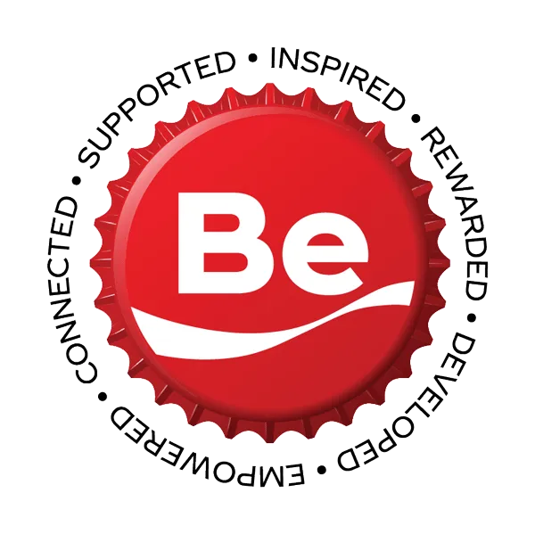
Be, under the cap.
The program mark is a bottle cap. The six promises run around its edge: supported, inspired, rewarded, developed, empowered and connected.
Program identity
02 The line
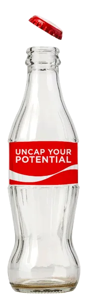
Uncap your potential.
The campaign line sits on the bottle itself, in the same red ribbon employees see every day.
Campaign line
03 The film
The promises, in motion.
A film brings the program to life.
Video
04 The walls
One promise per poster.
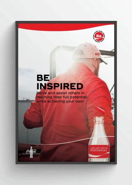
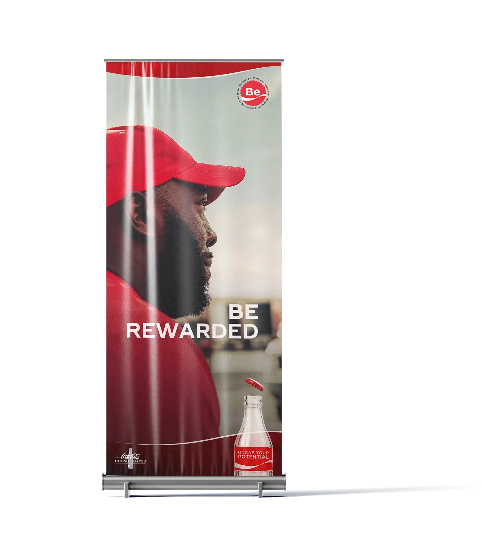
Posters and banners give each promise its own face and its own line, like Be Inspired and Be Rewarded.
Posters and banners
05 The office
Red in the room.
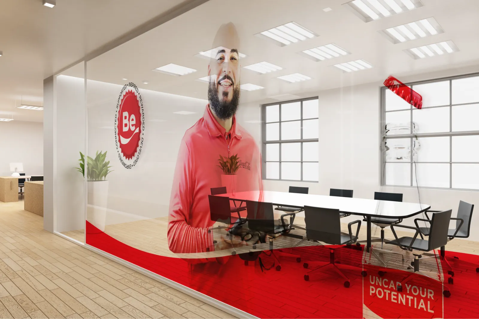
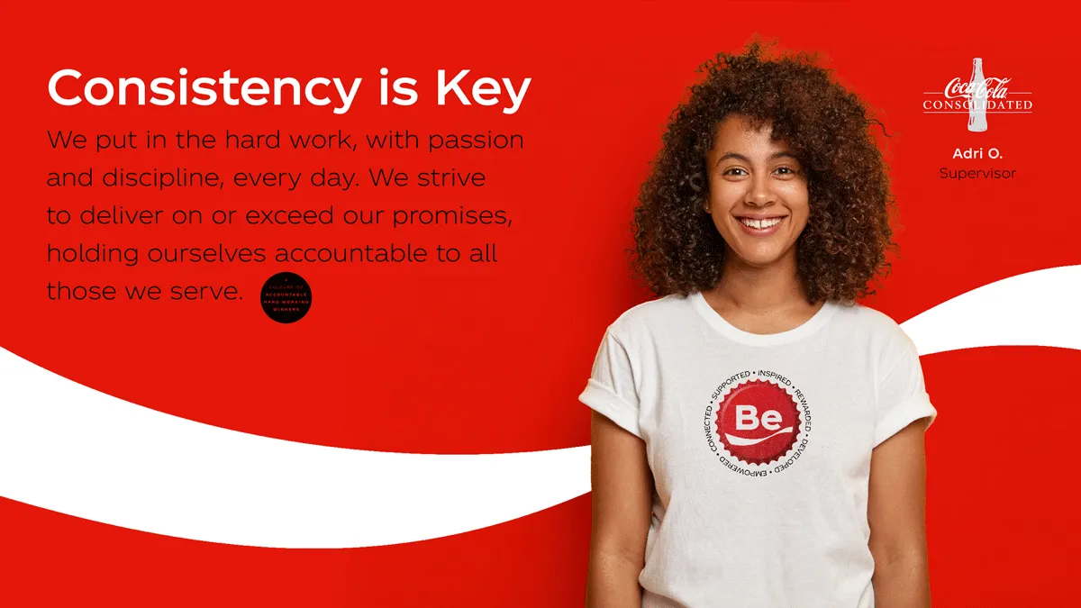
Window graphics and screens bring the program into meeting rooms and shared spaces, with messages written in the company’s own voice.
Environmental and digital
06 The road
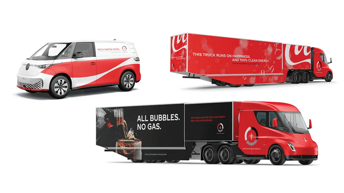
All bubbles. No gas.
As part of the fleet moved to electric vehicles, the trucks became the message. The signature red and ribbon stayed, and the trailer sides talked about clean energy in the brand’s own voice.
Electric fleet graphics
Six promises, one shared identity.
Be organized the program around six promises. The bottle cap and signature red tied each one to the brand employees work with every day, so every promise has an expression people recognize.
- Be supported
- Be inspired
- Be rewarded
- Be developed
- Be empowered
- Be connected
What we did
- Creative direction
- Campaign development
- Brand expression
- Program identity
- Posters
- Environmental graphics
- Video
- Fleet graphics