
Corners
No corners were cut.

Creative work keeps getting faster, and fast reads like a shortcut when nobody can see the steps. Corners is a board where every brief, draft, hand-off and sign-off goes on the record with a name and a time next to it. We built all of it: the name, the mark and its motion, the design system, the app and the site. Most of it works on this page. Go ahead and click.
Never cut.Show your work.
- Client
- Corners
- Category
- Creative production software
- Our role
- Everything: name, identity, motion, design system, product, website
- Status
- Pre-launch. Early access opens to studios in 2027. usecorners.com
The brief
Clients see creative work arrive faster than ever, and they wonder what got skipped.
The idea
Make speed look like care. Show your work. Every step on the record, with a name and a time.
The result
A brand and a product that prove the same point, starting with a mark that looks cut and never was.
Square on every side.
Eight stops from the mark to a finished spot. The board and the phone are live, so try them.
01 The mark
Turn it.
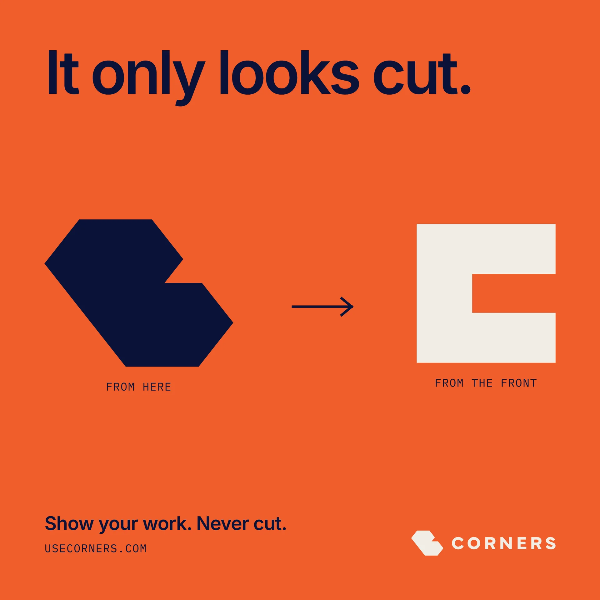
Flat, the C looks like a shape with a corner sliced off. Turn it and it’s a solid square C with every corner a right angle. Nothing was cut. That’s the whole promise, in one shape.
It also set the first rule of the system. A rounded corner is a cut corner, so everything in Corners is square: cards, buttons, chips, photos.
Naming, identity
Horizontal, primary One color on Ink
 Stacked
02 The motion
Three moves. Each one has a job.
The mark only turns in 3D through its own motion, and every motion starts and ends on the exact flat logo. One per screen, never more. Each move runs along the mark’s own axes. Nothing goes diagonal.
Mark motion
Block shuffle · 4.9s loop
03 The board
Fast work, on the record.
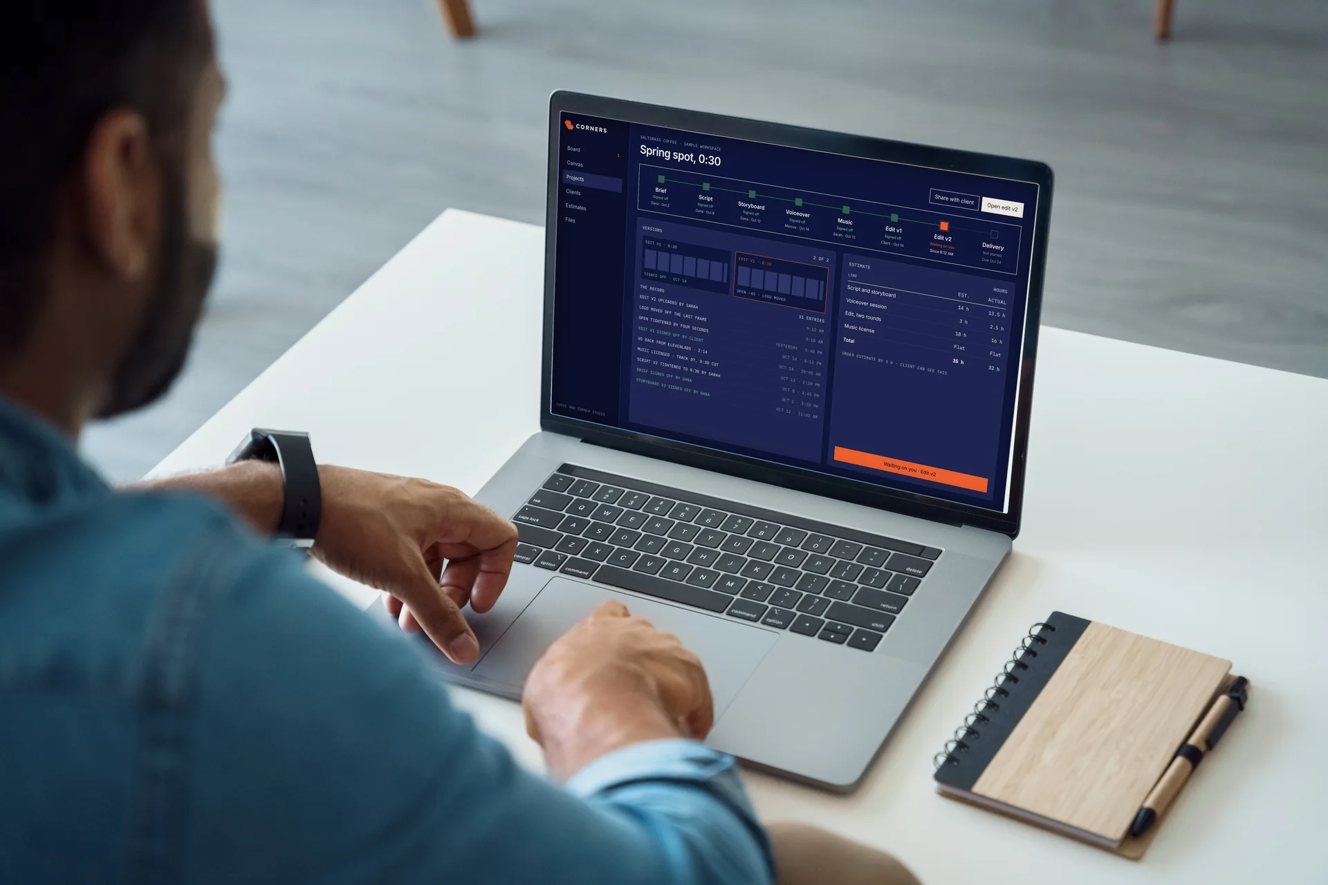
One board holds every step from brief to review. Orange means it’s waiting on you, and that’s the only thing orange means. Approve a card below and watch it move, pick up your name and the time, and land in the record. It runs a sample on its own, voiceover and all. Click anywhere and it’s yours.
Product design

One board for every tool.
The brief, the render, the voice session and the edit stop living in six tabs. Each step lands in the same place.
Clients see the steps.
The estimate before the invoice. The draft before the deadline. The second version, and why there was one.
Nothing happens by magic.
Every hand-off and every yes carries a name and a time. If it happened, it's on the record.
04 Client sign-off
Their whole job, one screen.
Clients don’t log in to a tool. They get a link. It shows what changed, what’s already signed and what it costs, then two buttons. Approve, or tell us what’s off.
Try it. The yes lands on the board with a name and a time, and the mark does the one thing it’s allowed to do at a sign-off: twist.
Client portal
Version 2 of your spring spot is ready.
We tightened the open by four seconds and moved the logo off the last frame. Approve it, or tell us what's off.
- Script
- Signed off · Oct 9
- Storyboard
- Signed off · Oct 12
- Estimate
- On budget
Signed off.
The edit has it. Sarah is on it.05 Start to finish
One job, every step, on the record.
Here’s a whole spot moving through Corners, from the client’s brief to the delivered film. Each step waits on a person, gets signed off with a name and a date, and lands in the record. By the time the spot plays, nobody has to ask what happened or who said yes.
Product design
06 Voice
The best producer you ever worked with.
Knows where every file is, never panics, tells you the truth about the timeline. Every status names a person or a time when it can. Flip the switch to hear how most software says the same four things.
Voice
- A file comes back
VO is back from ElevenLabs. 2:14, filed in Drive.
- Something breaks
Runway didn't answer. Your files are safe.
- Waiting on a client
Waiting on you to approve the storyboard.
- Nothing to do
Nothing's waiting on you. Rare. Enjoy it.
07 Color and type
Status colors mean one thing, everywhere.
Bone and Ink carry the brand and keep it from looking like every other navy and orange app. The three status colors mean the same thing in the app, the email and the client’s phone, and nothing else. Tap a color to see its job.
Color, typography, design system
Signal orange. The only time orange shows up outside the mark.
Proof blue. Moving, and needs nothing from you.
Mat green. Approved, with a name and a time.
Graphite. On the board, not moving yet.
- VO_SPRING_V3.WAV2:14
- STORYBOARD V312 FRAMES
- SIGNED OFF · DANA4:12 PM
- ESTIMATE · LINE 4ON BUDGET
08 In the world
Looks cut. Turn it. Never cut.
The site says it in three words and gets out of the way: show your work, then ask for early access. The launch post says the rest without a single feature.
Website, social

Speed that reads as care.
The enemy was never AI. It’s the shortcut you can’t see: the file nobody can trace, the approval that happened in a hallway.
So the brand gives up magic. No sparkles, no glowing orbs, no gradients. If a step happened, it’s on the board, and the mark proves the point every time it turns.
- Name
- Mark
- Motion
- Palette
- Type
- Voice
- Design system
- App
- Client portal
- Website
What we did
- Naming
- Positioning
- Identity
- Logo suite
- Mark motion
- Color
- Typography
- Icons
- Voice
- Design system
- Product design
- Client portal
- Website
- Brand guide