
Empath Health
A name with room to grow.
Suncoast Hospice had grown well beyond hospice. We led the brand through its move to Empath Health, with a nautilus identity designed to keep taking in what came next, through a merger, an integration and counting.
- Client
- Empath Health, formerly Suncoast Hospice
- Category
- Nonprofit health care
- Our role
- Creative direction, brand development
- Service lines today
- Twelve
The brief
The organization had outgrown hospice. Its name needed to hold everything it now offered, and whatever came next.
The idea
Lead with the disposition, not the department. Empathy keeps working as the services change.
The result
One name that has since taken in two more organizations without needing a new one.
Built in chambers.
A nautilus adds a new chamber at each stage of its life and keeps every one. So did this brand.
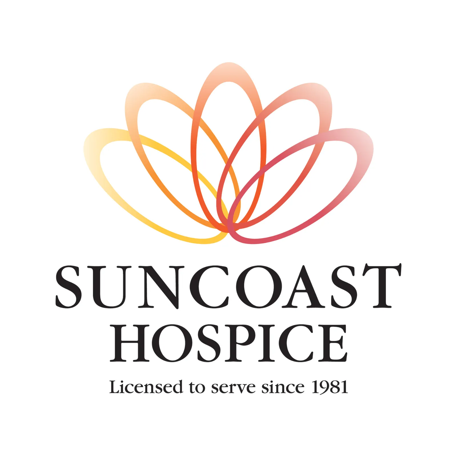
01 Before
Licensed to serve since 1981.
Suncoast Hospice had expanded into a broader range of care and support. A name built on one service had started to feel small.
The original identity
02 The name
From hospice to empathy.
A name built on function expires the moment the offering changes. Empath Health traded the specificity of hospice for the durability of empathy.
Naming

03 The mark
A shell that keeps every chamber.
A nautilus grows by adding chambers while carrying its whole history with it. It is also a protective structure built around something soft, a fitting shape for an organization rooted in hospice care.
Identity
04 The color
Cool outside, warm within.
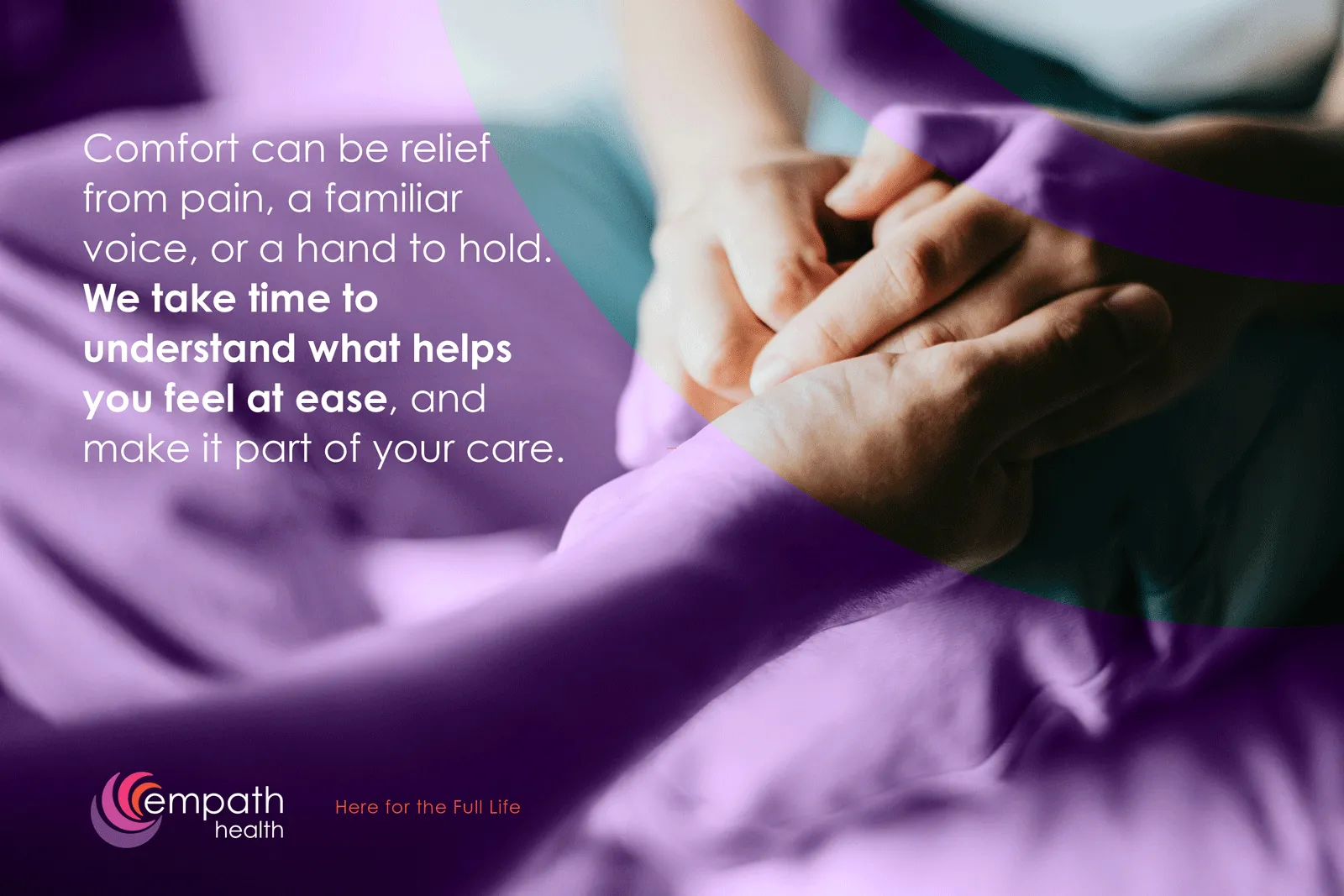
The palette runs from purple at the edge into pink, magenta and orange at the center. The lowercase wordmark stays quiet, so the mark can carry the feeling.
Color and type
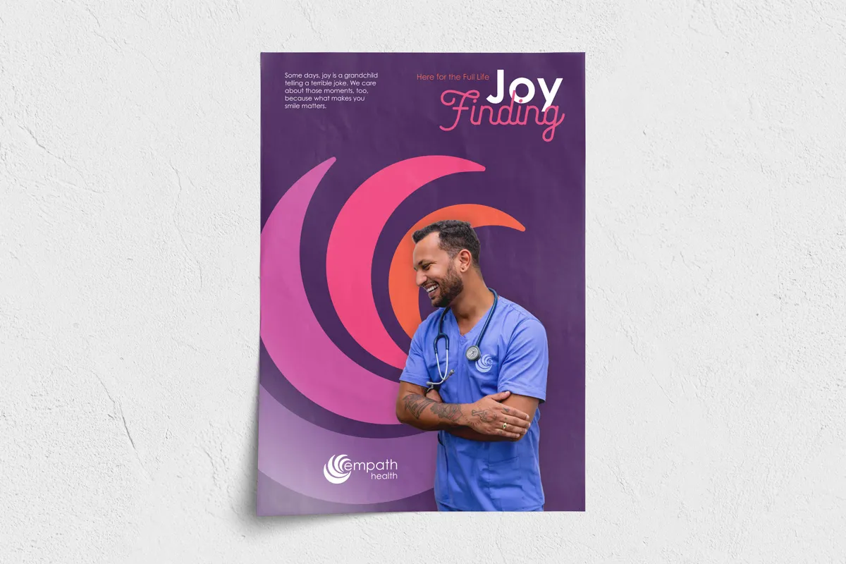
05 In the world
Here for the full life.
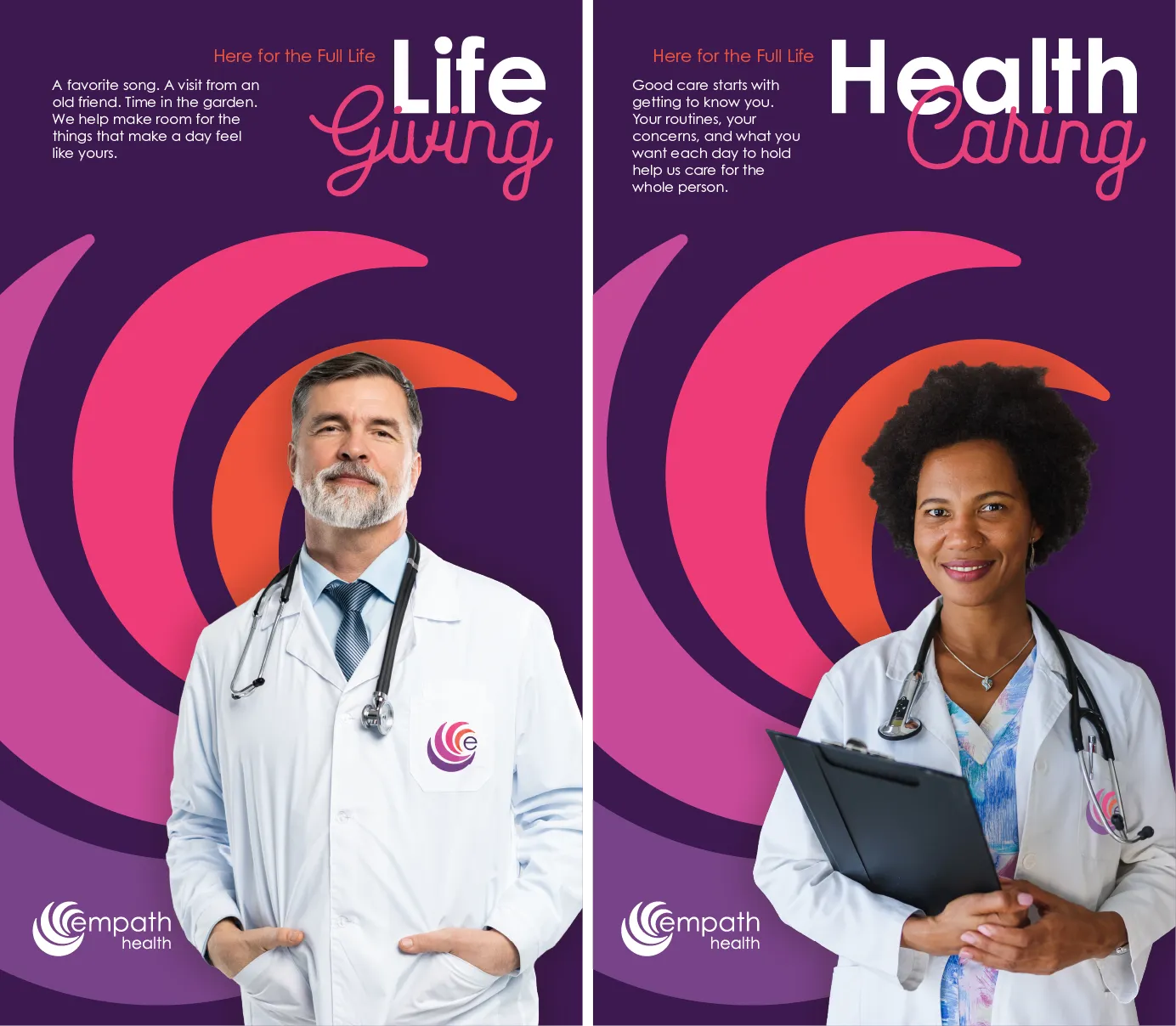
Posters put caregivers at the center of the spiral, with lines like Joy Finding, Life Giving and Health Caring.
Campaign
Twelve service lines, one name.
Today the organization offers twelve service lines, from home health to grief services to HIV and sexual wellness, and none of them feel awkward under this name.
After the 2021 merger with Stratum and the integration with Trustbridge, now Florida’s largest nonprofit hospice network, the name is still doing its job. It was built to keep holding new additions.
- Suncoast Hospice
- Stratum, 2021
- Trustbridge
What we did
- Creative direction
- Brand development
- Identity design
- Color system
- Campaign