
RM
Make yourself hard to forget.
RM is a creative director with twenty years of brand work behind him and no identity of his own. We drew him a mark from one continuous line, gave it one blue and one typeface, then built a website and a brand guide around a single piece of glass.
- Client
- RM, creative director
- Category
- Personal brand
- Our role
- Identity, brand guide, website
- The system
- One line, one blue, one typeface, 100 icons
The brief
Look like someone who builds brands for a living, without shouting about it.
The idea
Hold back on everything except one thing. One line, one blue, one piece of glass.
The result
A mark you can draw from memory and a site where the work gets the attention.
Restraint, with one thing to remember.
Eight stops through the identity and the site. Four of them are live, so draw, type and tap.
01 The mark
One line.
The mark is a single stroke with round ends. It rises, arches, drops and climbs again, then a small arc closes it. Drag to draw it, and switch the ground to see the only three ways it appears.
Logo
Blue on paper. The line rises, arches, drops and climbs again, then a small arc closes it.
02 The glass
One piece of glass.
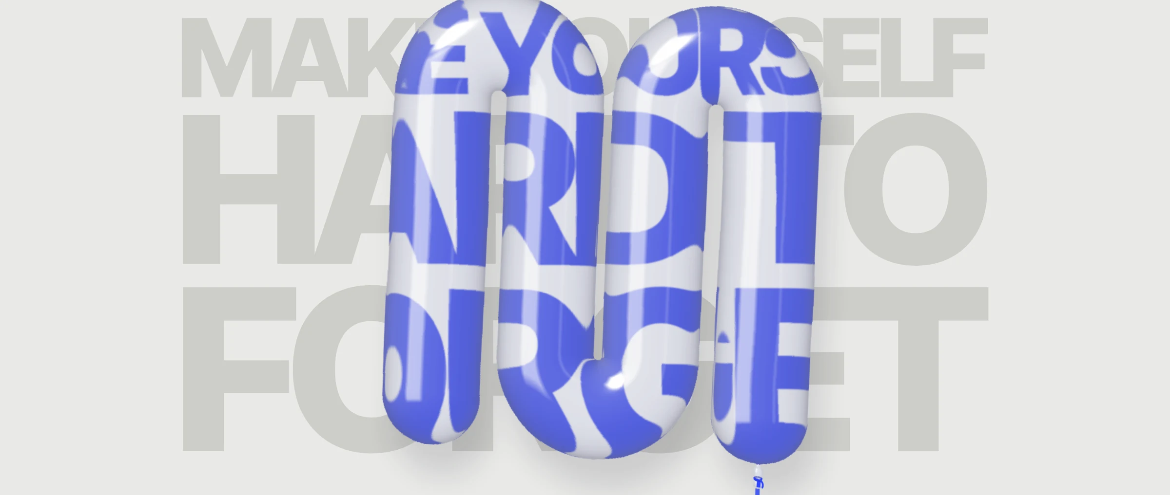
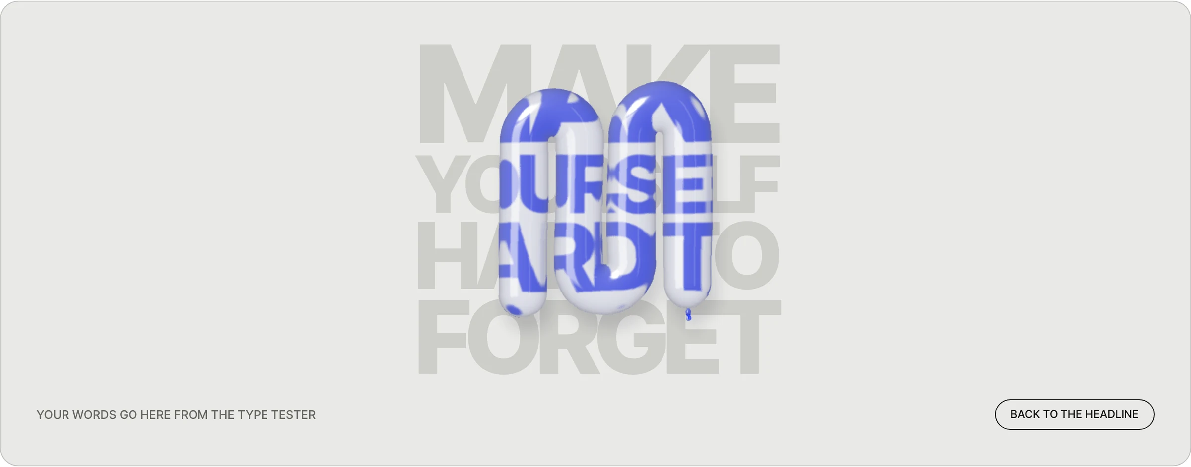
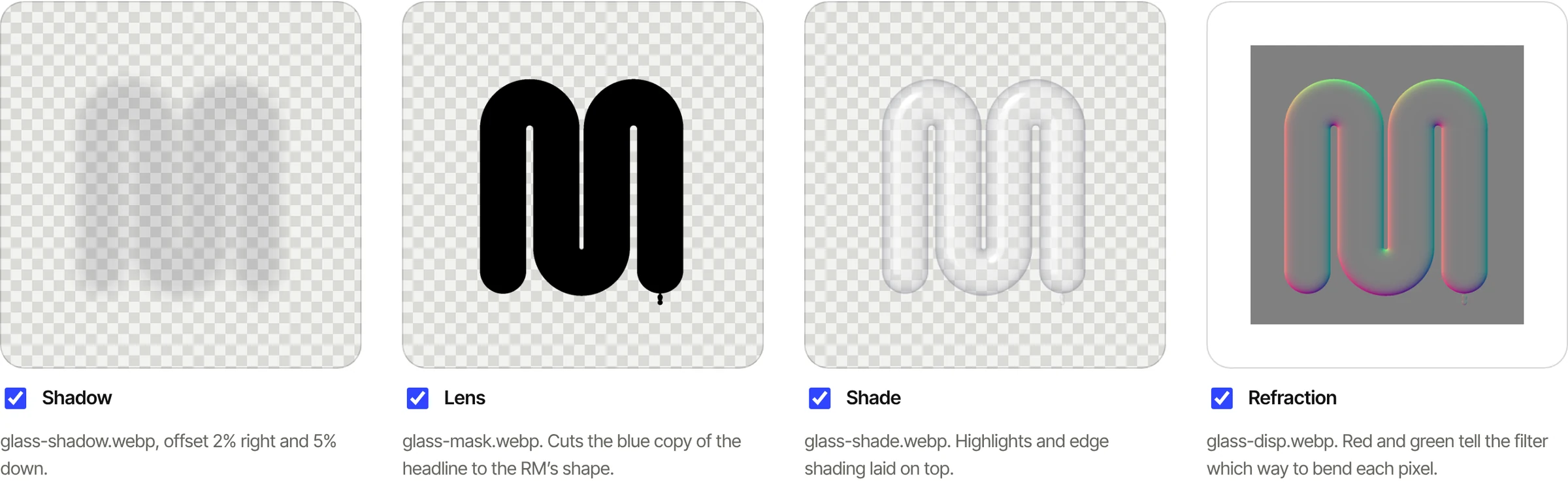
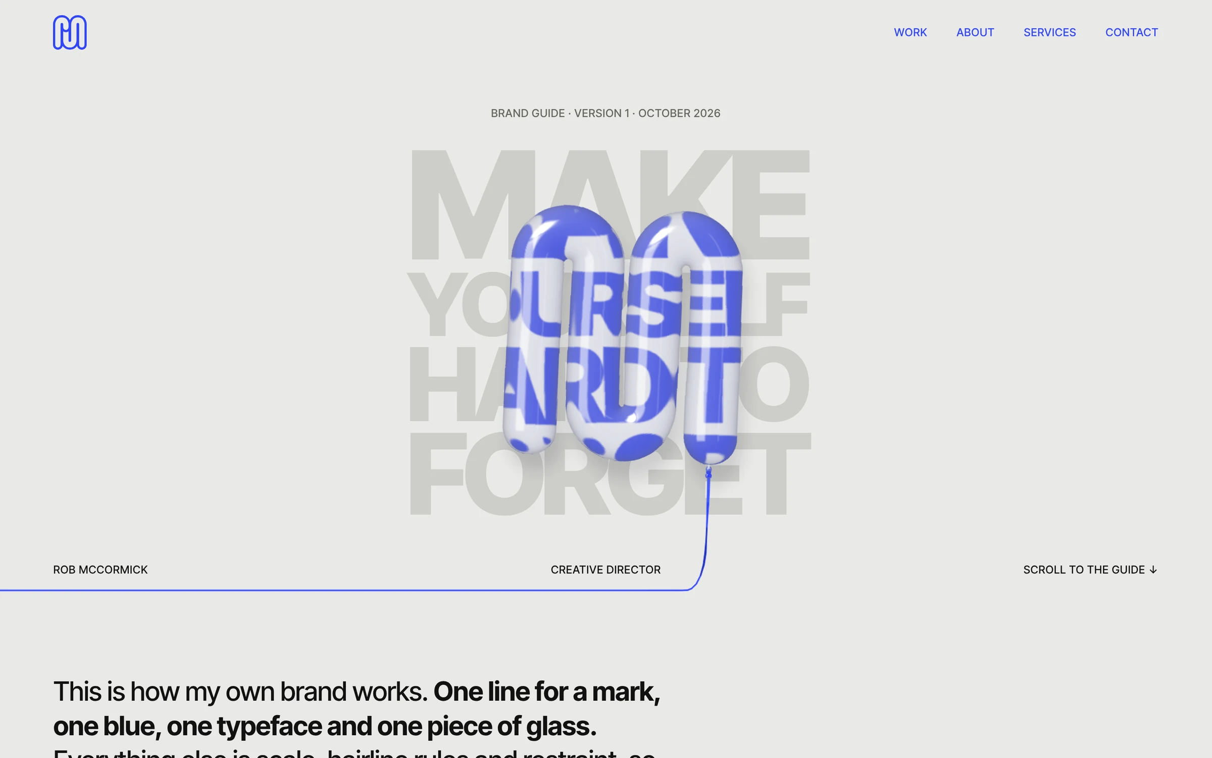
An inflated, see-through RM floats over the headline. A copy of the words sits inside the lens in blue, magnified and bent, so the type reads through the glass. Four layers make it work: a shadow, a lens, a shade and a refraction map.
Signature moment
03 Color
One blue.
Warm grey paper, near-black ink and a single electric blue. Pages change ground instead of adding colors, and every supporting color is a tint or a role of the core three.
Color
How every page scrolls: paper, then the dark band, then one blue band to finish.
Tap any color to copy it. Everything below the core three is a tint or a role of one of them.
04 Type
One typeface, every weight.
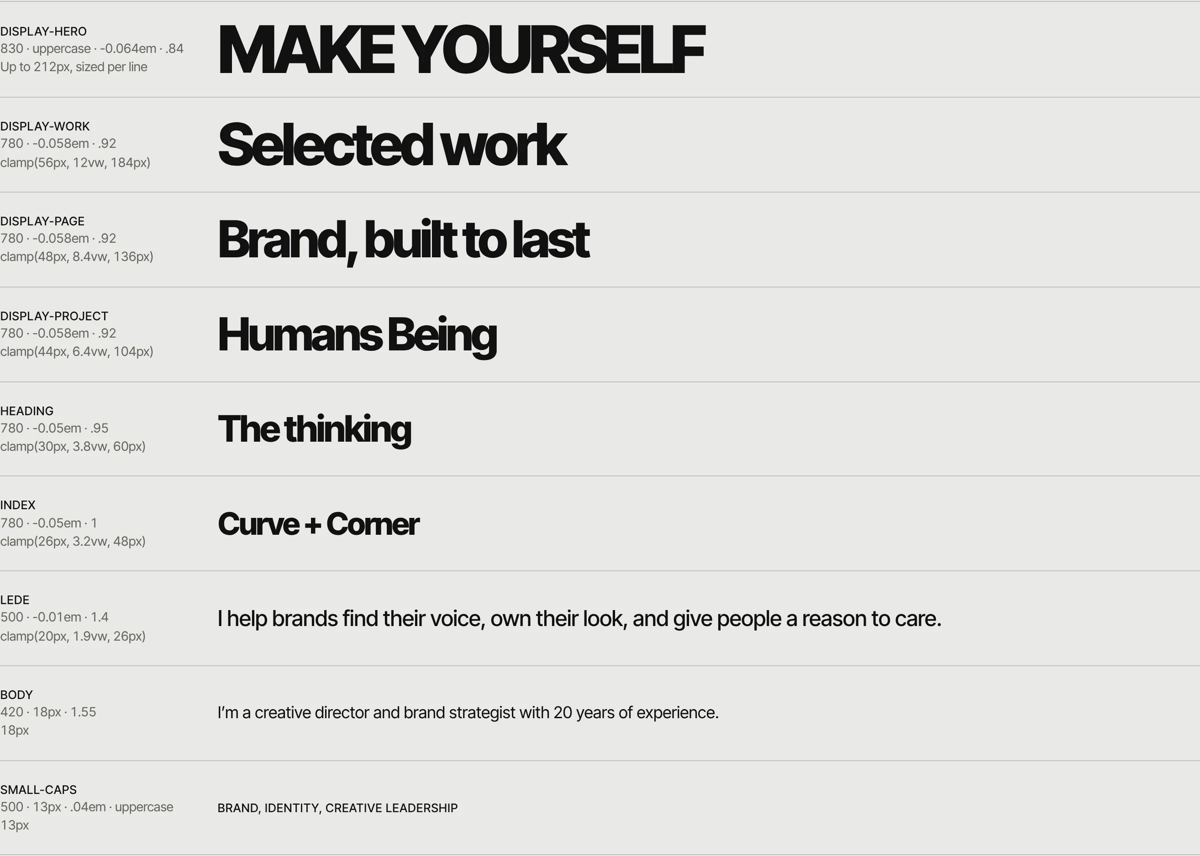
Inter Tight does everything. Weight carries the hierarchy, from 420 for reading to 830 for the poster voice, and headlines run tight. Try the presets, then write a line of your own.
Typography
Make yourself hard to forget
One variable file does every job, from 100 to 900. Click the line to write your own.
05 Icons
Drawn with the same line.
A hundred icons on a 24px grid, in the mark’s own round stroke with arched tops. Line is the default. Glass adds the lens behind it for feature moments.
Icon set
06 The rules
Rules, not boxes.
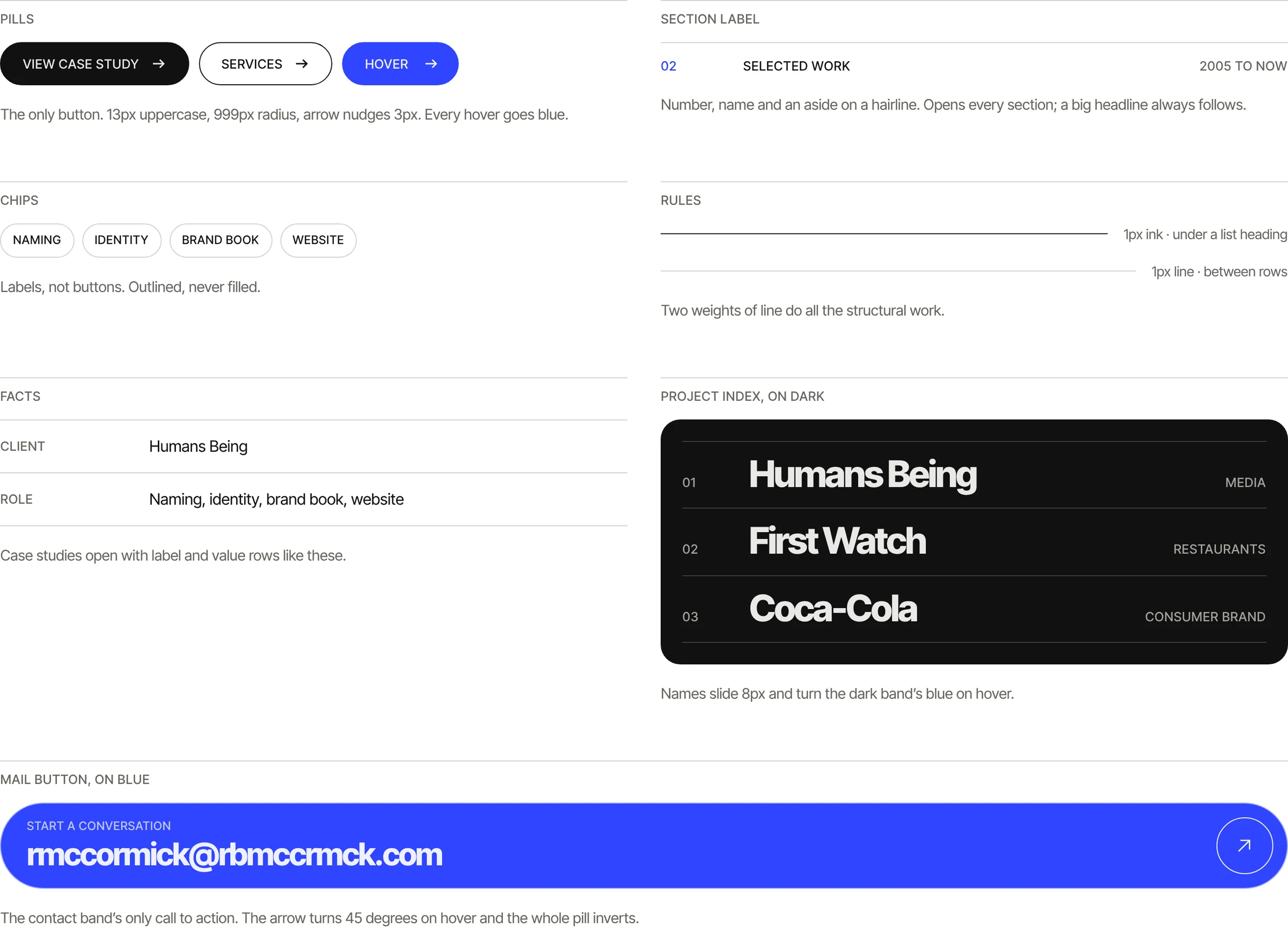
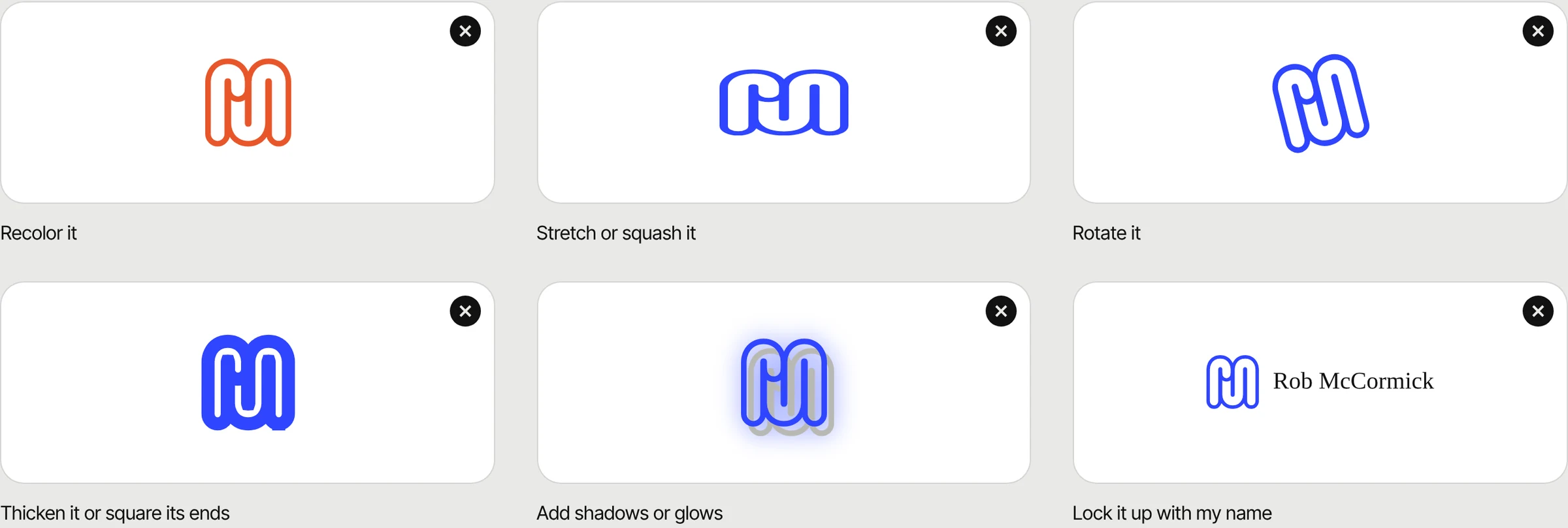
Structure comes from hairlines above labels, rows and lists, not cards or tinted panels. And the mark has a short list of things nobody gets to do to it.
Elements and logo rules
07 Motion
Quick to settle.
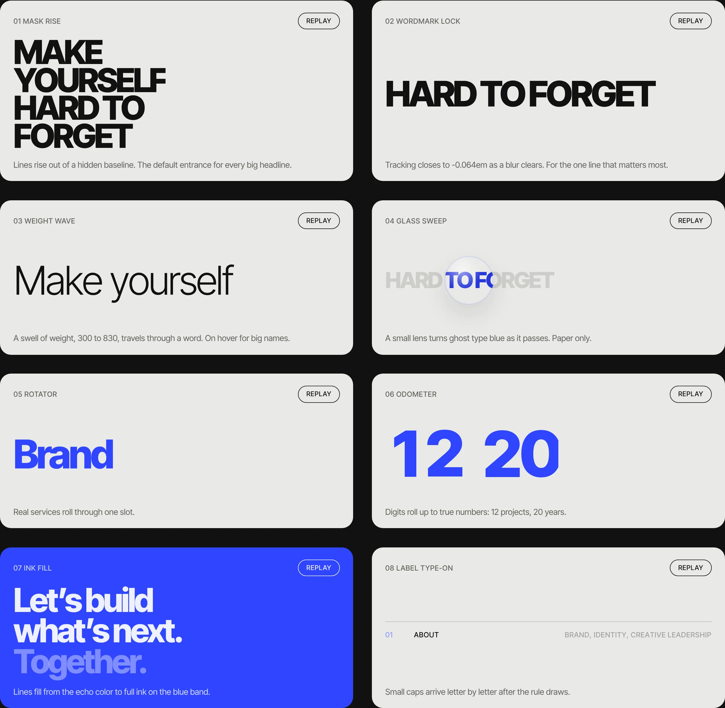
Motion is quiet and physical. Things arrive fast and land softly, lines draw, and only the glass is allowed to move on its own. Eight type treatments, one per view.
Motion
08 The site
A site that gets out of the way.
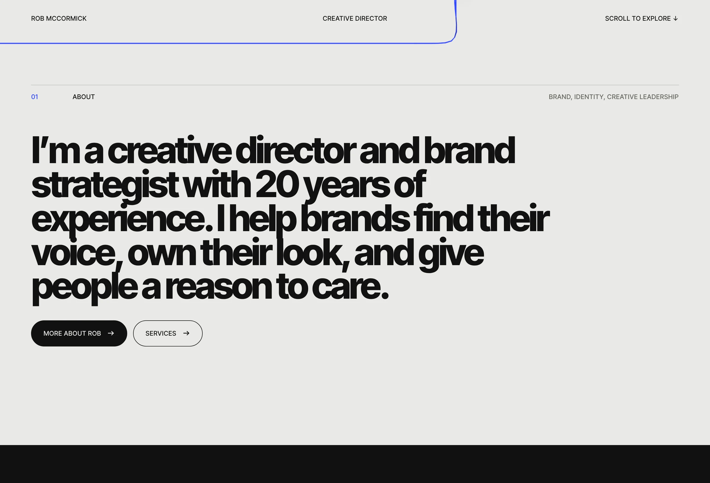
The website runs on the same three grounds: paper for the introduction, a dark band for the work and a blue band to start a conversation. The brand guide lives right alongside it.
Website and brand guide
Visit the site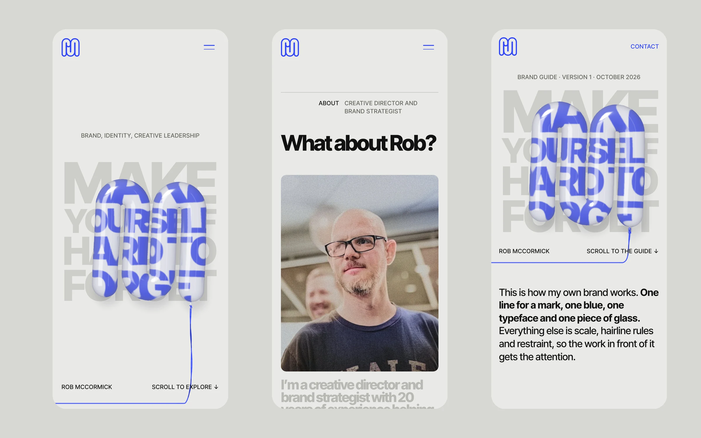

One line. One blue. One typeface.
Everything else is scale, hairline rules and restraint.
When the brand only does a few things, it can do them loudly, and the work in front of it gets the attention.
- Mark
- Glass
- Color
- Type
- 100 icons
- Motion
- Website
- Brand guide
What we did
- Identity
- Logo
- Color
- Typography
- Icon set
- Motion
- Website
- Brand guide
- Art direction