
The Curve + Corner brand
Both halves, built together.

Going independent meant introducing a studio, not a freelancer. We named Curve + Corner and built everything that carries it: the mark, the motion, the palette, the type, the icons, the voice and this website. Most of it you can play with below.
- Client
- Curve + Corner, our own studio
- Category
- Creative studio
- Our role
- Naming, identity, voice, website
- The system
- Logo suite, palette, type, 100 icons, motion
The brief
Introduce a studio that feels senior and personal at the same time, with one simple way to say what makes the work different.
The idea
Put the method in the name. Curve is the part people feel. Corner is the part that holds.
The result
A brand that proves its own point: one half to make people care, one half to keep it standing after launch.
Round on the outside, square on the inside.
Seven stops through the system. Five of them are live, so drag, tap and try them.
01 The name
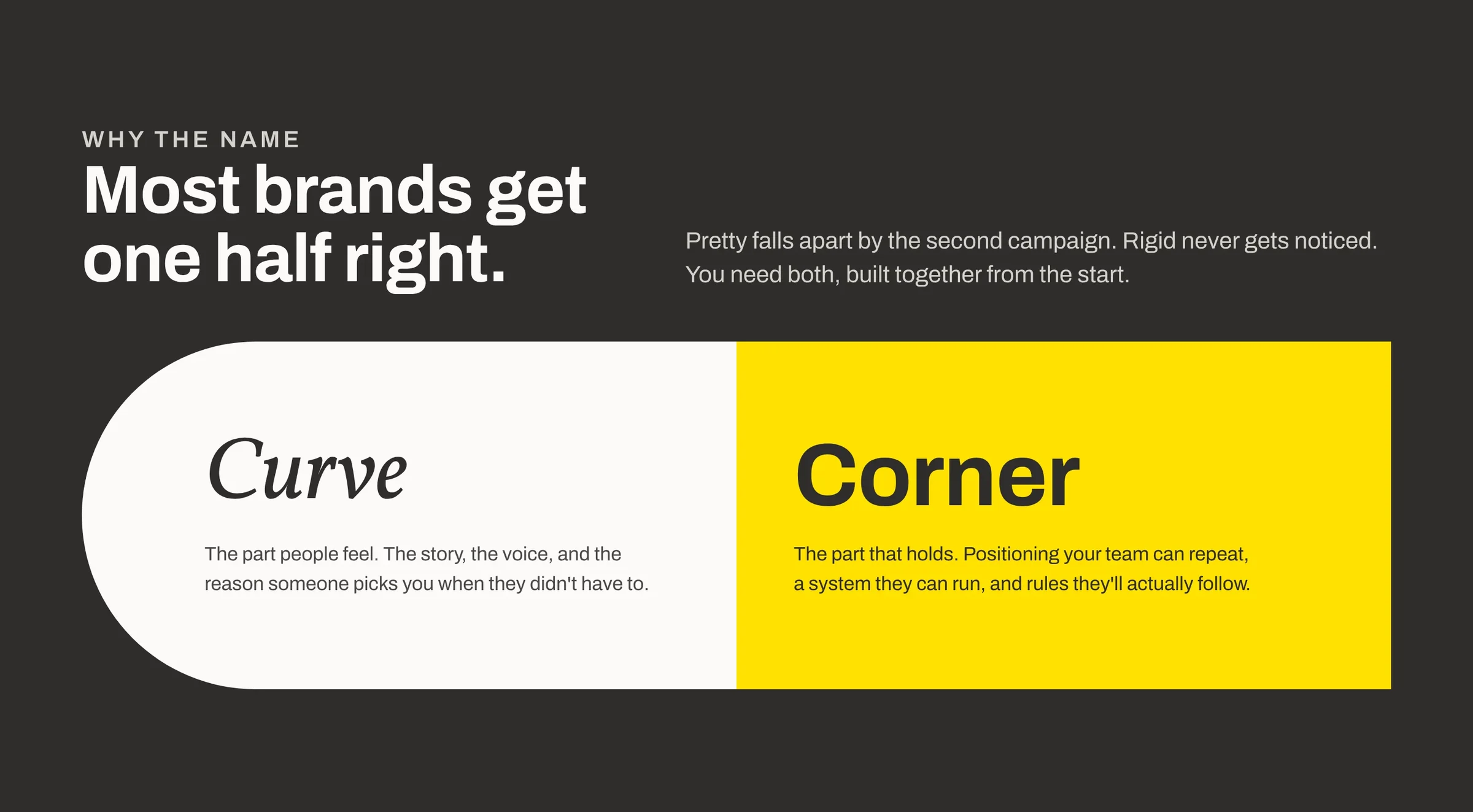
Most brands get one half right.
Pretty falls apart by the second campaign. Rigid never gets noticed. Curve + Corner says that in the name, then proves it in everything the studio makes.
Naming
02 The mark
Build the mark.
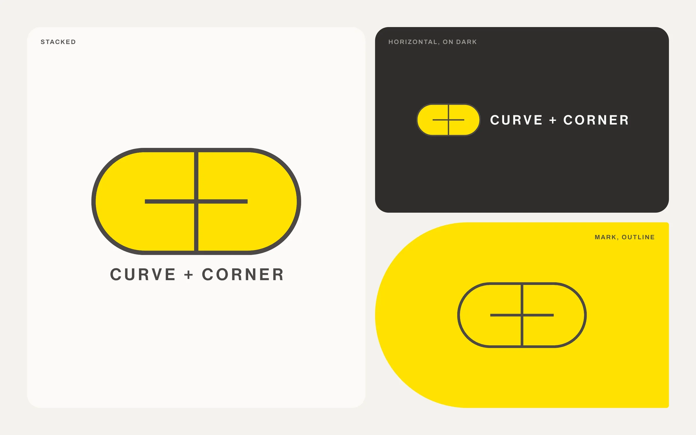
A rounded pill cut by two straight lines that meet at right angles. Drag Build to put it together the way it draws on the home page, then Turn to give it the half turn it makes as you scroll.
Logo and motion
- 01 Two halves
- 02 One outline
- 03 The cross
- 04 The half turn
03 Curve or Corner
Pick a side.
The mark holds both halves of the name. Choose one and watch it change. The outline, stroke and cross never move. Only the corner radius does, from 81 to 0.
Shape system
04 Color
Warm grays carry the page. One yellow carries the energy.
No gradients, no shadows, nothing pure white or pure black. Change the ground and the logo follows its own rules: color on light, paper type on dark, outline on yellow.
Color and logo suite
Color version. Graphite line and type, yellow pill.
Tap a swatch to copy it.
05 Type
Two faces. One for feeling.
Archivo does almost all of the work. Vollkorn Italic shows up one word at a time, where the feeling lives. Flip the line to see why it takes both, then write your own.
Typography and voice
Built for the twists and turns.
Both. A hard Archivo line carries the message and one soft Vollkorn word lands it.
Then tap the one word that should carry the curve.
06 Icons
A hundred icons, one yellow curve.
Every icon is a corner-built line with one curve tucked behind it. Duo at 24px and up, Mono for 16px and yellow grounds. Hover to watch one draw itself.
Icon set
07 The site
The studio’s first case study.
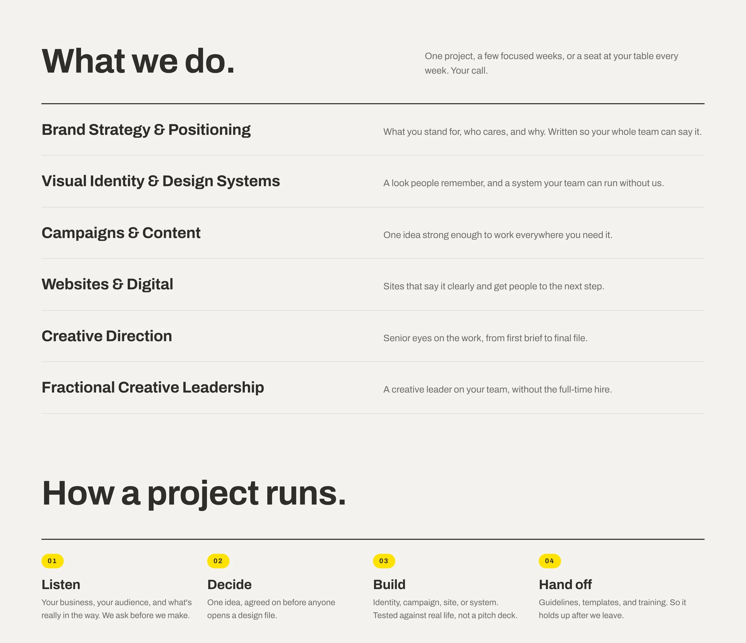
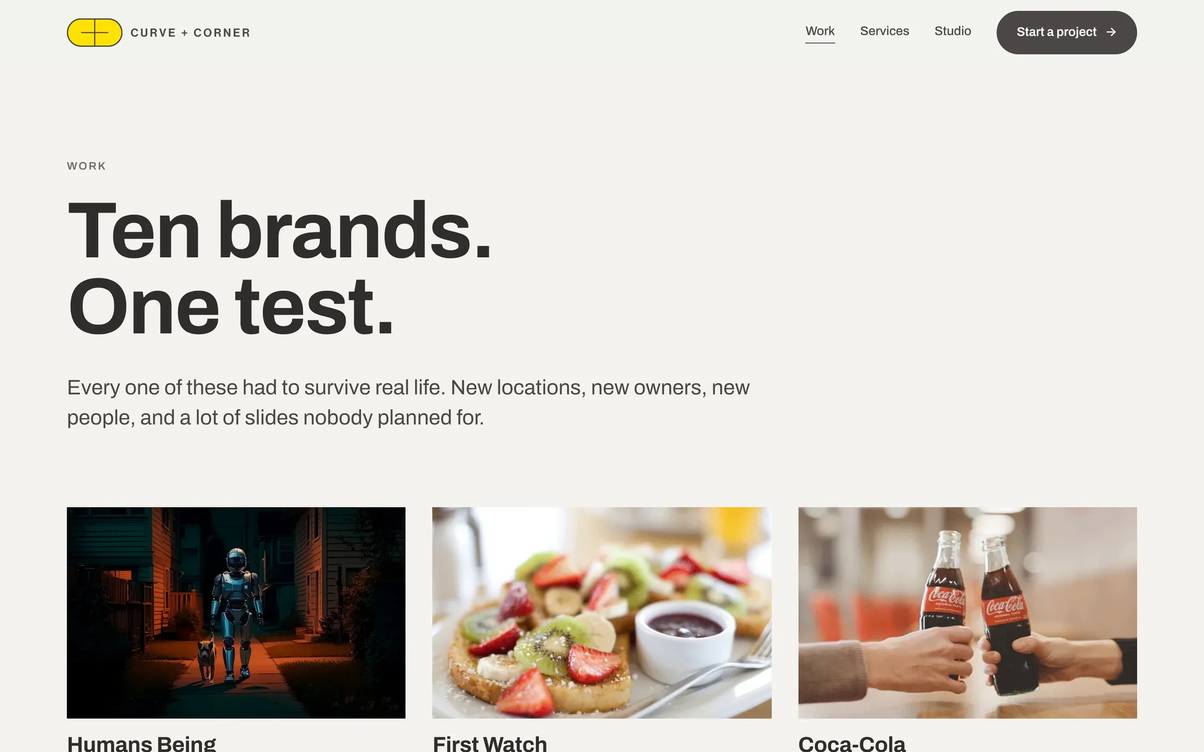
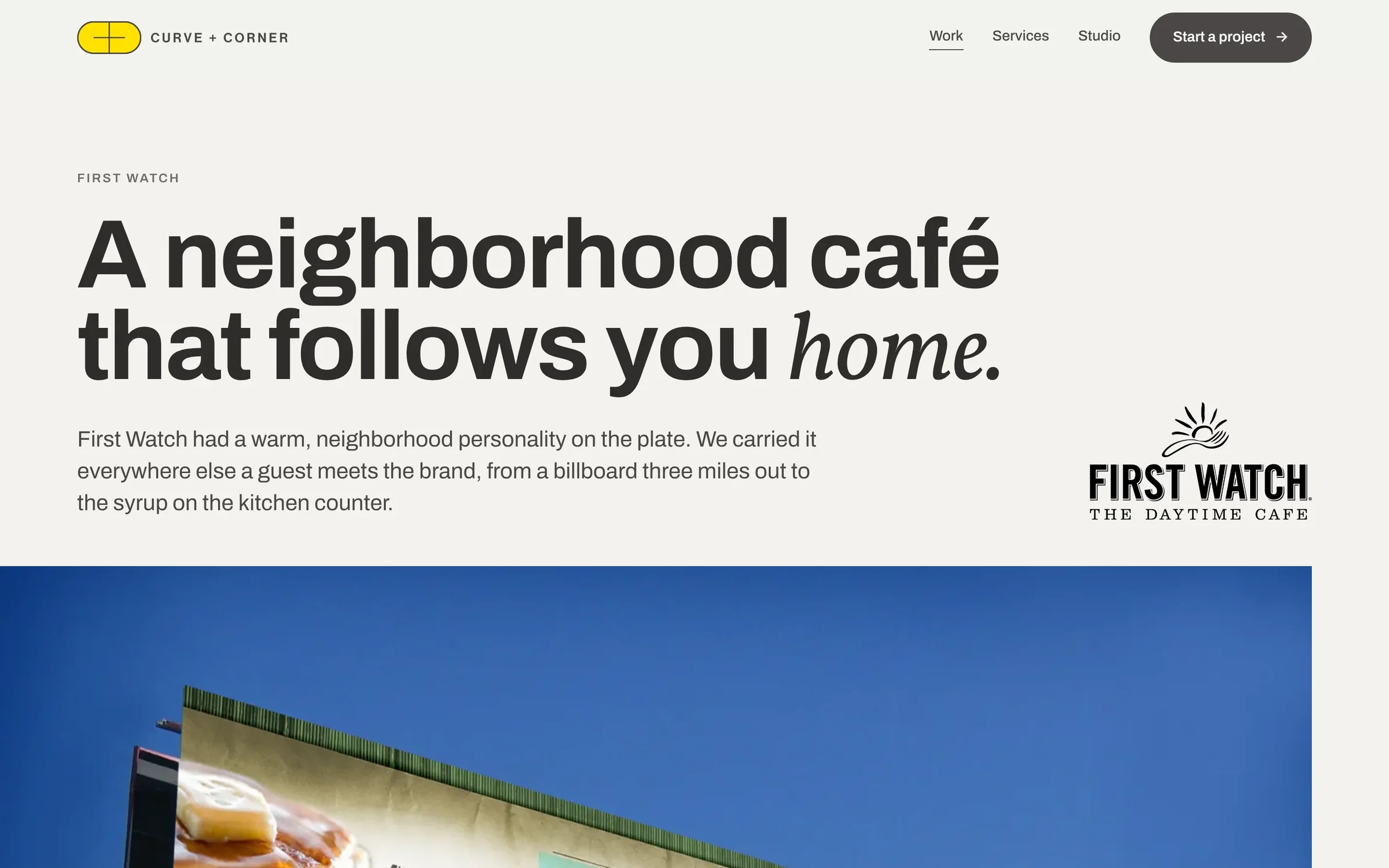
The website leads with proof instead of promises, then the work, the services and how a project runs. Every page speaks in the same two voices: a hard headline with one soft word.
Website
Visit the home page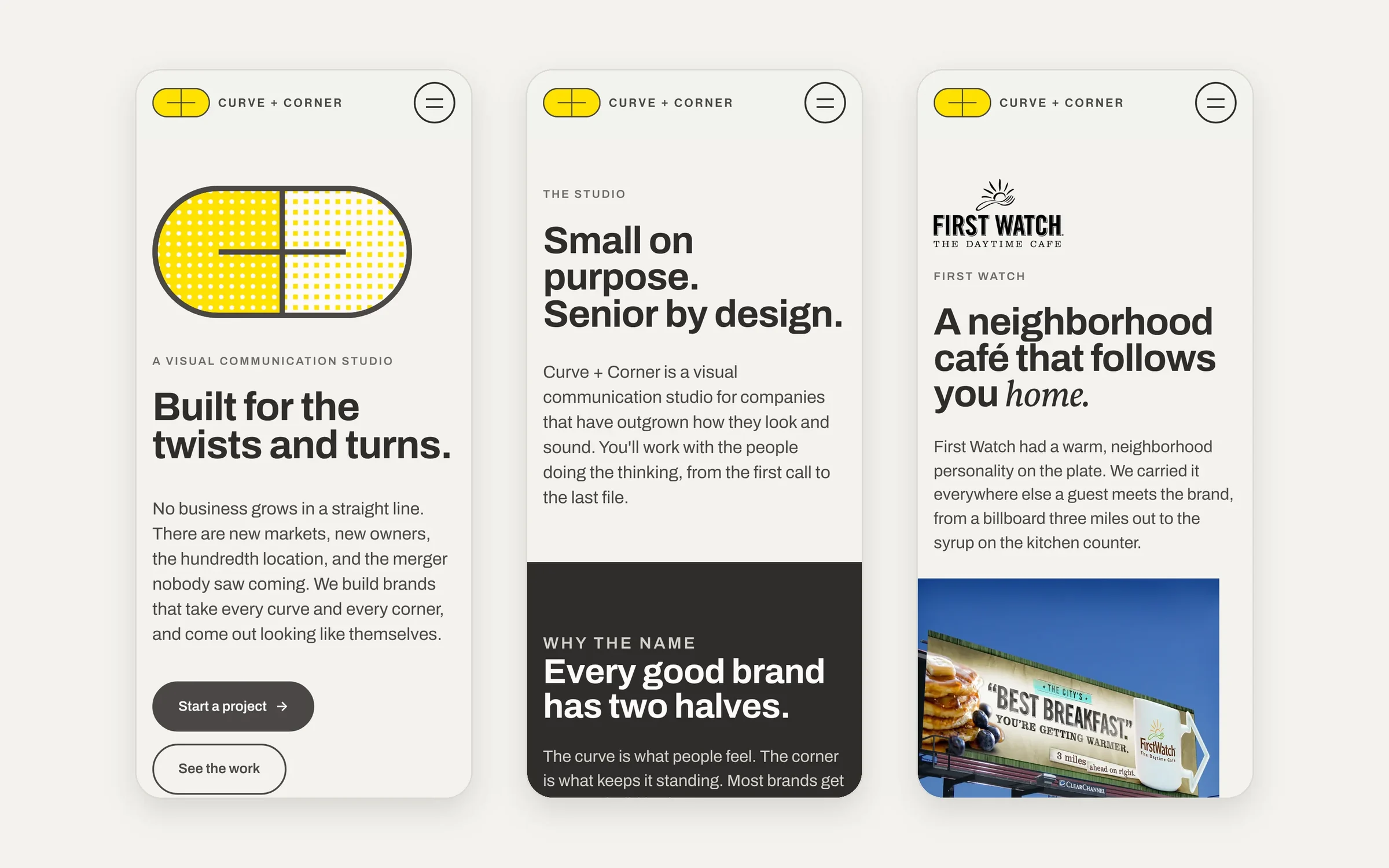
One half to care. One half to hold.
Curve is the story, the voice and the reason someone picks you when they didn’t have to.
Corner is positioning a team can repeat, a system they can run and rules they’ll actually follow. The brand had to be both before we could promise either.
- Name
- Logo suite
- Palette
- Type
- 100 icons
- Motion
- Voice
- Website
What we did
- Naming
- Identity
- Logo suite
- Color
- Typography
- Icon set
- Motion
- Voice
- Website
- Brand guide